Whisked Into the Spotlight: Turning a Stand Mixer Into a Brand Statement
- Collabs & Projects
- Jul 14, 2025
- 4 min read

Updated: Jul 26, 2025
Superwhatever partnered with KitchenAid to launch its 2023 Color of the Year in an unexpected way – by turning a humble stand mixer into a New York Fashion Week spectacle. The buzzworthy Hibiscus campaign showcased our conceptual creativity and full creative-direction range. This case study reveals the strategy behind that campaign – from the initial big idea to the runway execution – and how a strong narrative transformed an everyday product into a cultural moment.
The Challenge: Blend Kitchen and Couture
KitchenAid is beloved for its stand mixers, but in 2023 the brand wanted to do more than unveil a new mixer color – they wanted to make a statement in culture. Each year, KitchenAid names a Color of the Year for its products, and for 2023 the hue was Hibiscus (a vibrant fuchsia pink). Rather than a standard product launch, the company’s vision was to introduce Hibiscus with the flair of a fashion event. The motto said it all: “The kitchen is for everyone.”flaunt.com In other words, they aimed to show that kitchen creativity intersects with art, style, and inclusivity.
The challenge for Superwhatever was clear: how do we translate a consumer appliance into a captivating fashion experience? Our task was to celebrate KitchenAid’s Color of the Year in a way that would resonate with fashion audiences and media, bridging the gap between a household brand and high couture.
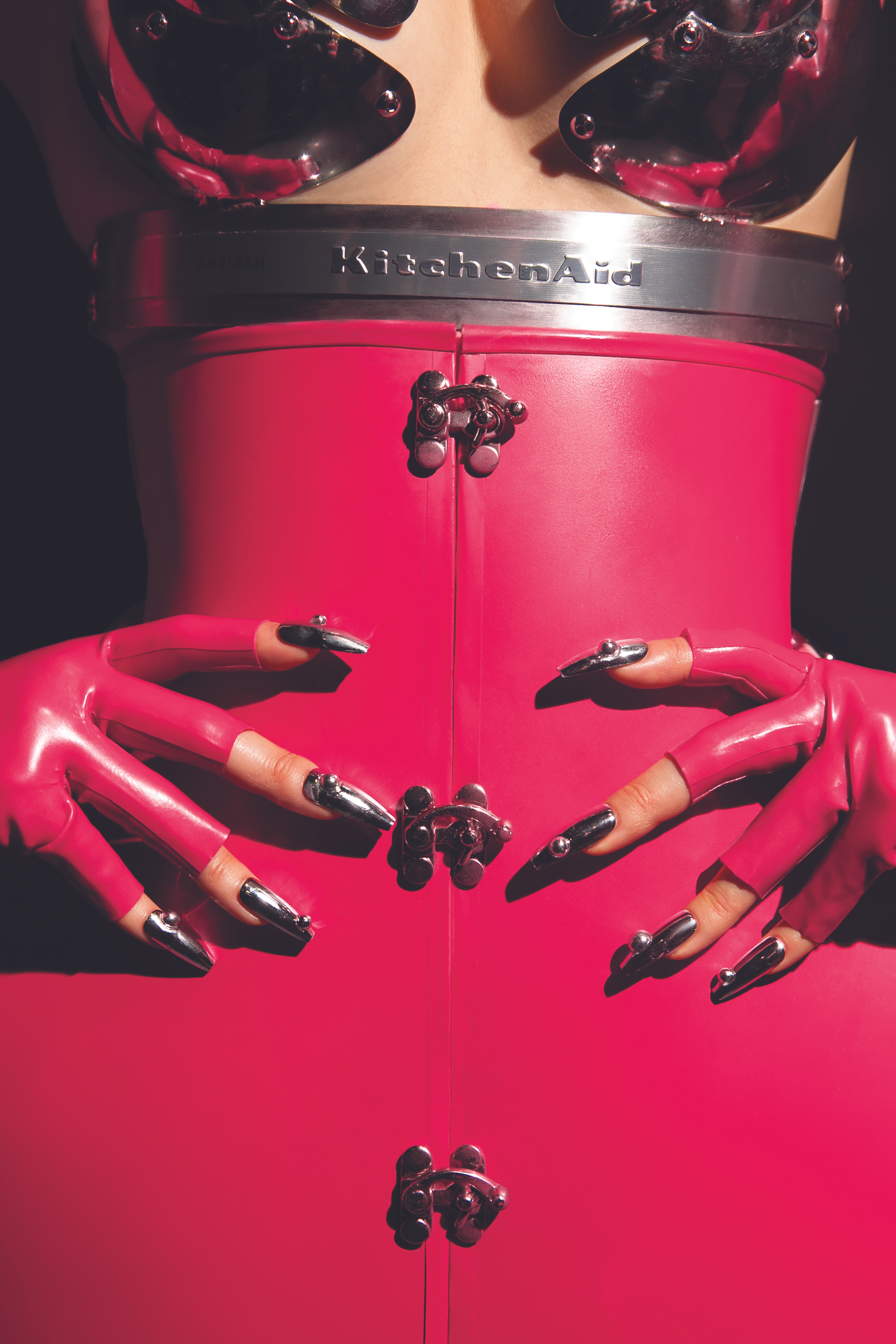
The Big Idea: Hibiscus Couture – Industrial Meets Floral
Marta del Rio, who led the project’s creative direction, conceived a narrative that embraced contrasts. The concept was to marry the industrial design of a KitchenAid mixer with the organic beauty of the hibiscus flower (the inspiration for the color).
“The whole inspiration behind the aesthetic was fully dictated by the color itself… It was great to have such opposites – a manmade hard industrial object and a super soft floral – inspiring the design,”
Marta explains in her interview with Flaunt Magazine. By focusing on the tension and harmony between machine and nature, we found a fresh creative direction that felt true to KitchenAid’s identity yet exciting in a fashion context.
Importantly, the idea wasn’t just visual – it was conceptual. It asked the question: What if a kitchen mixer were the muse for a couture collection? That daring prompt led to an even bolder answer.
“We’ve seen people being inspired by vintage vehicles, by architecture, but no one really goes, ‘let me get inspired by a household appliance, a mixer.’ So in my head there was a part of ‘nobody has done this!’ and that just felt fun.”
This novelty factor became a driving force for the project.
The Hibiscus color itself became our guiding thread. This vivid fuchsia pink symbolizes creativity and attraction – qualities we wanted to amplify on the runway. Every design element would revolve around that hue and the story of blending worlds. We informally dubbed the theme “kitchen couture,” setting out to literally mix culinary and fashion imagery in unprecedented ways.
From Sketches to Runway: Bringing the Vision to Life
Marta also enlisted five emerging NYC designers to collaborate on a 12-look capsule collection (seven of the looks were her own designs). By fusing their distinct aesthetics with KitchenAid’s instantly recognizable product shapes, the collection celebrated both new talent and the brand’s design heritageflaunt.com.
The design process was deeply immersive. Marta spent time with the product itself to draw inspiration. “I literally watched so many cooking videos, printed so many images of the machine, put it on my drawing board and drew around it,” she recalls, “I got really comfortable with the shape, the silhouette and the lines within the object.”
From there, translating mixer shapes into couture details was like alchemy – mixer bowls became sculptural skirts and hibiscus petals blossomed into dramatic ruffles. The collection struck a balance between soft and hard elements, achieving a perfect marriage of those elements.

The NYFW Experience: A World Drenched in Hibiscus
On February 9, 2023, the concept came to life at New York Fashion Week’s kickoff. We transformed an event space in Manhattan into an immersive hibiscus-themed world. The signature pink hue was everywhere – from the lighting that bathed the room, to the hibiscus-colored carpet and décor, to the custom cocktails and treats.
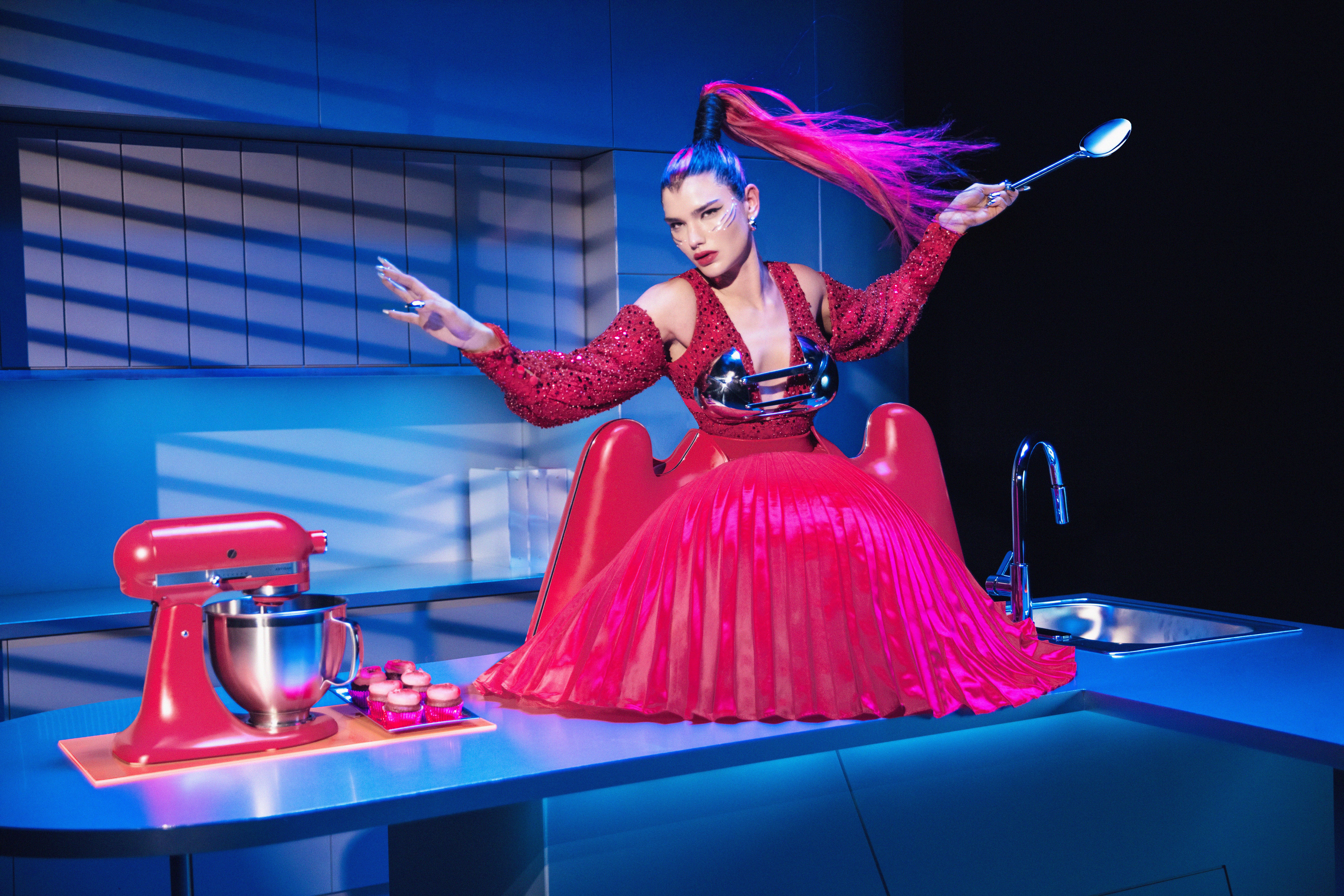
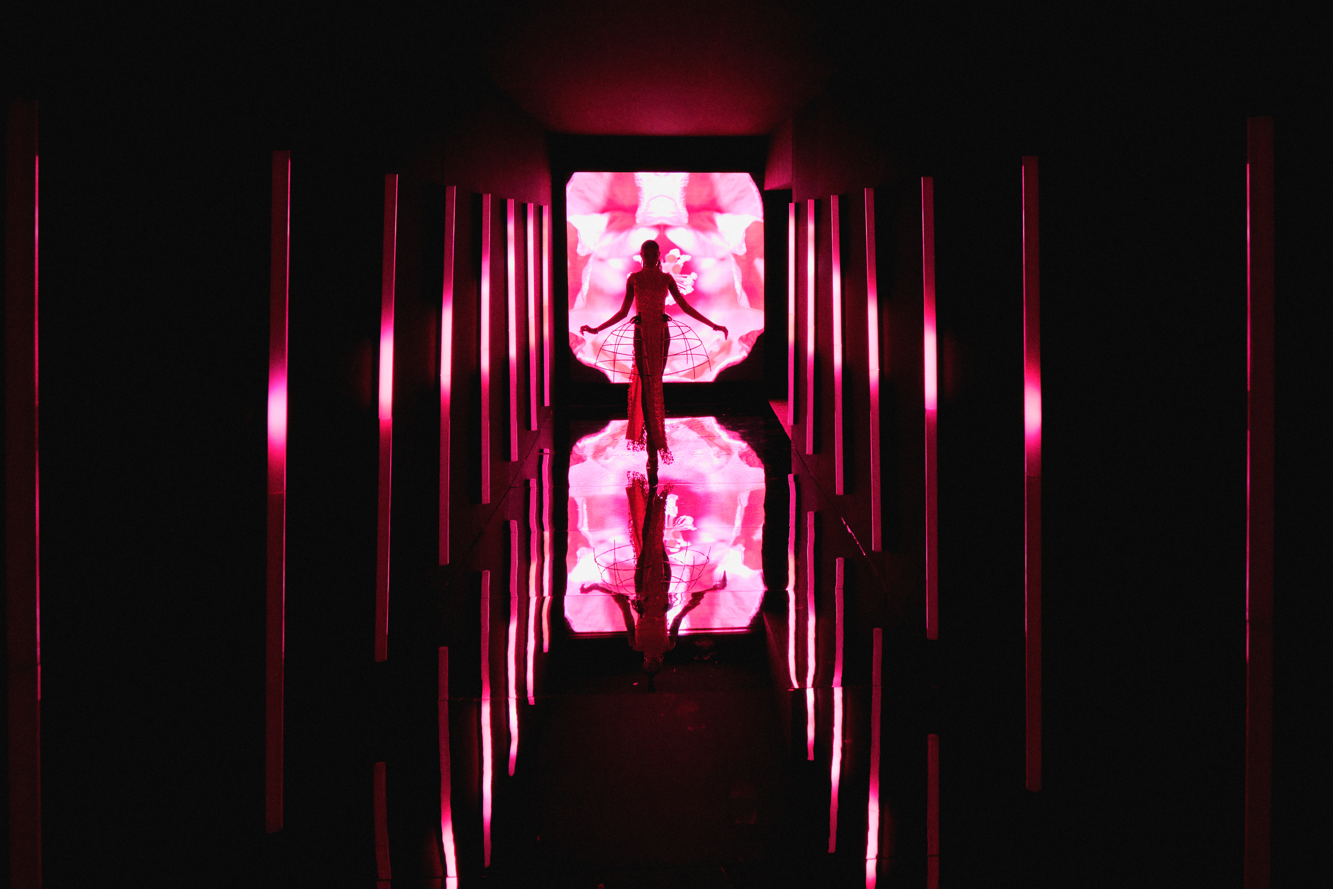
Models glided out in avant-garde ensembles that were dramatic yet playful. Giant sculptural silhouettes echoed the curves of the mixer, and vibrant floral accents paid homage to the hibiscus inspiration. Importantly, this wasn’t a commercial clothing line to sell, but a conceptual showcase. “We are not trying to make clothes to sell, it is just raising our glass to color, design, and the idea that the sky’s the limit,” Marta emphasized during the show in her interview with Flaunt Magazine. The atmosphere was joyful and boldly imaginative – a celebration of design and the blending of two seemingly separate worlds.
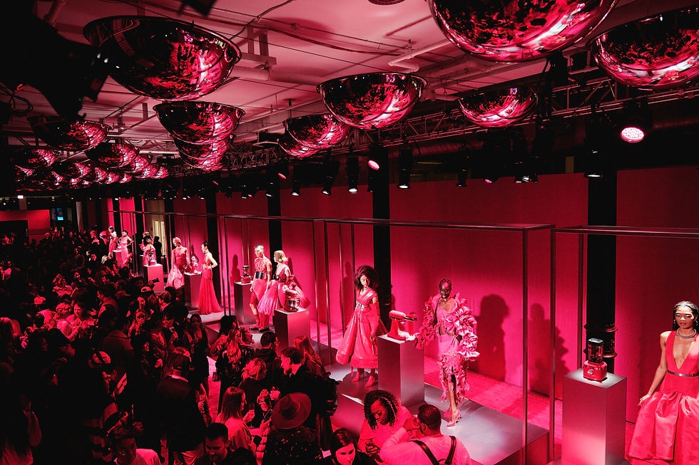
The event generated a flurry of buzz. It drew interest from both the food world and the fashion press, effectively positioning the stand mixer as a conversation piece beyond its usual realm. As one outlet noted, KitchenAid used the power of color to comment on trends and culture with this collaboration– mission accomplished.

Impact and Takeaways
The “Hibiscus NYFW” campaign gave KitchenAid a fresh spotlight at fashion’s biggest stage, proving that even a heritage appliance brand can spark cultural conversations. It also celebrated emerging designers and reinforced KitchenAid’s identity by weaving its iconic product design into high art. The story resonated widely – showing that inspiration can come from anywhere and creativity has no boundaries, echoing KitchenAid’s inclusive ethos.
For Superwhatever, the project demonstrated our ability to apply a narrative-driven creative approach to any brand – whether high fashion or home appliances – and create a memorable moment.
Don’t be afraid to cross creative boundaries. With the right strategic narrative, any brand – no matter how traditional – can generate buzz and cultural relevance by reimagining its story in a new light. This case study proved that bold ideas, backed by thoughtful execution, can redefine how people see a brand.
Is your brand looking for its own “out-of-the-box” moment? Book a strategic discovery call with Superwhatever and let’s brainstorm something extraordinary.


Comments