Visual Identity Is Strategy: How We Build Worlds, Not Just Looks
- Collabs & Projects
- Jul 21, 2025
- 4 min read

Visual identity isn’t just about making things “look good” — it’s how your brand communicates who it is. At Superwhatever, we believe that creative direction and brand strategy are inseparable. In this post, we explore how we build immersive, emotionally resonant visual systems for clients across sectors — from consumer brands and tech platforms to fashion houses and cultural icons.
Why Visual Identity Is More Than Aesthetics
“Brand identity” often brings to mind logos, fonts, or color schemes. But in reality, visual identity is strategy — when done well, it tells your audience who you are, what you stand for, and how you want them to feel about your brand.
It’s not about decorating. It’s about storytelling in design form.
Think of iconic brands: you recognize them immediately — not just from their logo, but from their tone, their layout, their photography, their packaging. That’s intentional. Visual systems, when rooted in a clear story, create lasting emotional impact.
As Marta del Río explains in her interview with METAL Magazine, she was drawn to creative work because of its immersive potential: “It felt like the most magical reality ever. It was art that could be worn, lived and breathed, and I wanted to be part of that.”
That’s why visual identity matters. It allows your customers to live — not just observe — your brand’s story.
Building Worlds, Not Just Looks
To truly engage people, your brand needs visual consistency and emotional depth — what we call world-building.
That means every touchpoint — from your landing page to your packaging to your pitch deck — should feel like part of the same story. A visual system brings it all together: a set of design rules, aesthetics, and symbols that stem from your brand’s narrative and voice.
Whether you're launching a CPG product, building a fintech platform, or scaling a direct-to-consumer brand, world-building applies. It creates trust, emotional connection, and immediate recognition.
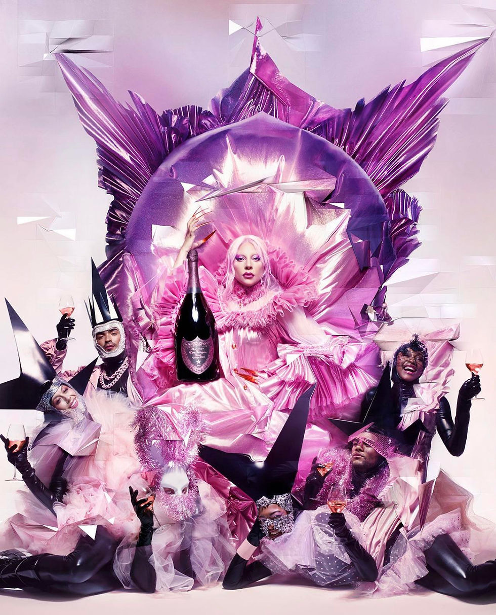
Take the example of Lady Gaga’s Chromatica era. Marta del Río worked alongside a team of avant-garde collaborators to define the album’s dystopian aesthetic — a unified visual world spanning cover art, fashion, and performance. As she told Vogue, Gaga is “the best way to define avant-garde... daring, modern, a transgressor.”
That strategic visual language wasn’t just for show — it was a cohesive, story-first identity system. Every element — from metallic bodysuits to clawed prosthetics — reinforced a clear worldview.
This isn’t limited to celebrities. We apply the same visual storytelling principles to:
Tech startups looking to build emotional connection
CPG brands needing a standout shelf presence
Cultural organizations seeking clarity and resonance
From Story to Visual System: Our Approach
At Superwhatever, we treat visual identity development as a strategic journey. Here’s a peek at how we build visual worlds for our clients:
Story Mining
We begin by uncovering the brand’s narrative. What’s your heritage, mission, and culture? Who is your audience and what do you want them to feel? We often conduct workshops with founders and brand directors to articulate the story before any design happens.
Visual Strategy Blueprint
Next, we translate key story themes into visual concepts. Is your brand story about rebellious innovation, feminine empowerment, or sustainable craftsmanship? Each core theme can inform imagery and style. We create mood boards and concept sketches to align visuals with those messages.
Design Language Creation
With the strategy set, we develop the tangible identity elements – logo, color palette, typography, imagery style, and graphic motifs. This becomes the “language” of your brand’s world. (For example, a nature-inspired beauty brand might use earthy tones and organic shapes that reflect its narrative.)
World-Building Across Touchpoints
We then apply this design language across all brand touchpoints (website, packaging, social media templates, in-store design, etc.) to ensure a unified look and feel. This is where our role blends creative direction and art direction – guiding the big picture and sweating the visual details.
Throughout this process, our philosophy is that creativity and strategy go hand in hand. In her interview with METAL Magazine, Marta del Rio spoke to the role of cross-cultural inspiration in creative leadership: “I find so much inspiration in diversity and exploring that which is unknown to me. It helps me to really broaden my creative thought process and explore new perspectives and approaches.”
By researching art, global culture, and subcultures, we infuse each visual identity with unique references that make the brand world more compelling and relatable.
Bringing It to Life: A Cross-Sector Example
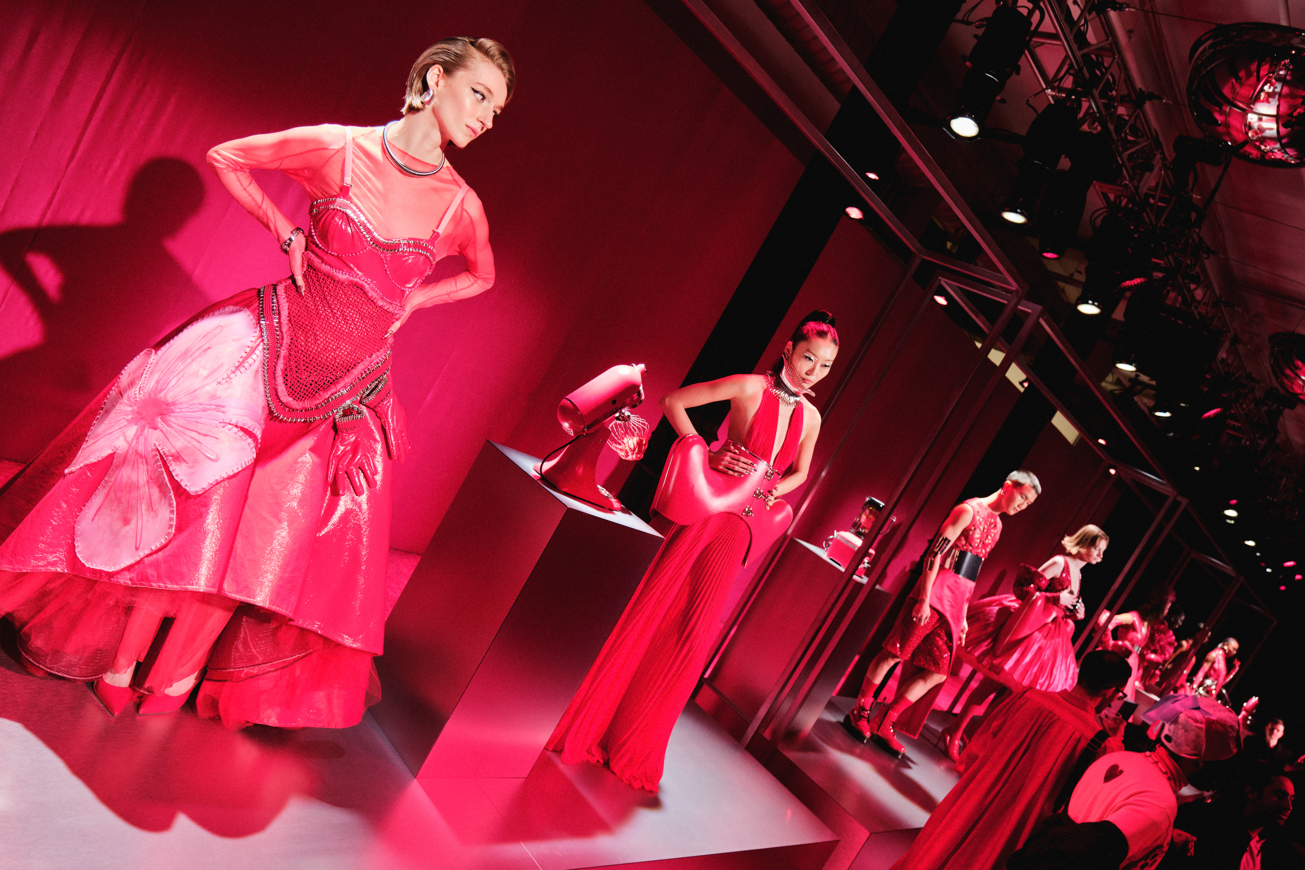
One recent example of this “world-building” approach was our collaboration with KitchenAid.
The challenge? Launch their Color of the Year 2023 (Hibiscus pink) in a way that connected with younger audiences and stood out beyond traditional product marketing.
Instead of doing a standard product shoot, we created a full runway capsule and fashion week event — translating the mixer’s silhouette into couture pieces, and turning its color into a symbol of creativity.
See our case study “Turning a Stand Mixer Into a Fashion Moment” for a deeper look.
Whether it’s a tech gadget or a couture gown, our aim is to give brands the full world treatment. By aligning visual design with strategic storytelling, we ensure that every campaign or identity we create isn’t just aesthetically pleasing, but meaningful and memorable.
The Bottom Line: Strategy, Then Design
In summary, a strong visual identity is not an afterthought – it’s strategic. Brand leaders who approach visuals as part of their business strategy (not just “make it look nice”) see stronger brand recognition and customer loyalty. People fall in love with brands that have a soul and a story, and your visuals are often the first chapter of that story they encounter.
Key Takeaway: Visual identity is brand strategy made visible. By building a consistent world around your brand’s story, you move from just “looking good” to resonating deeply with your audience.
Book a strategic discovery call with Superwhatever and let’s start building your brand’s universe.
Comments